“Share the light upon the stars as your wish came true.”

-Pia More
▪ About Me ▪
▪ About Me ▪
▪ About Me ▪
▪ About Me ▪
▪ About Me ▪
▪ About Me ▪
▪ About Me ▪
▪ About Me ▪

Sophia Lorraine More

*+:。.。~She/ her~。.。:+*
Follow me on my socials!!!

About Me

Before I was drawing stickman in my wall, but now I love visualizing in the form of art with a widespread possibility.
I'm Pia, a Filipino Multimedia Arts student who is known for creating both cartoony and realistic drawing styles. Today, I am pursuing my graduation from STI Ortigas-Cainta and mastering the complexity of design, communication, and writing.

Do

▪ Cartoons
▪ Realistic Drawings
▪ 3D Modeling

Don't

▪ NSFW artworks (with minors involved)
▪ Scams
▪ Reposting Online
▪ NO Hateful Content

Mission

My purpose is to handle consistent works, release with a shower of creation, and be a good example of a impactful student.

Vision

My vision set their challenges to give their potential where everyone knows how to be responsible, respected, and represented as leaders regardless of their social status.

Know about me!

Name
Sophia Lorraine More
Date of Birth
December 23, 2003
Location
Pasig, Philippines
MBTI
INFP

Favorite Color Palettes

Red
Purple
Baby Blue
Brown
Beige
Royal Blue

Favorite Artists & Genre

KPOP

OPM

JPOP

Note: Some producers I liked such as Siinamota and Wowaka has passed away. It is better to be respectful and support their works.

Traditional Arts:

Digital Arts:

Canva
Alight Motion (For iOS and Android)
Blender
Microsoft Word
Microsoft Powerpoint
FlipaClip (For iOS and Android)
Capcut
IbisPaint (For iOS and Android)
Webflow
WordPress

My Artworks

Traditional Works

Digital Works

3D Modeling

3D Animation

Fan Arts

Coloring Book (Digital)

Harold and JJ

Creative Documents

Presentations

To view on full progress, click on one of these presentations.
https://www.canva.com/design/DAF_lbSZk-E/nE3K2SCyRVXgHT--u2kBuQ/edit?utm_content=DAF_lbSZk-E&utm_campaign=designshare&utm_medium=link2&utm_source=sharebuttonhttps://www.canva.com/design/DAF2dJroweI/taxwAhL6r8udcd5K-VwKeQ/edit?utm_content=DAF2dJroweI&utm_campaign=designshare&utm_medium=link2&utm_source=sharebuttonhttps://www.canva.com/design/DAGDPwK7cA4/-HgO9v1HGWiQgn4oDnxEFA/edit?utm_content=DAGDPwK7cA4&utm_campaign=designshare&utm_medium=link2&utm_source=sharebutton

Photos

The Usage of the Preferred Typography

What is Typography?

When we type on the keyboard, the screen shows letters focused on used fonts. And, we see the typewritten fonts on every poster, newspapers, websites, and more. As technology evolves, the art remains the typography for every design in everyday life.

Typography is a mechanical process in which typing with designated fonts is supposed to be readable and legible. Therefore, it is an art of styling text. The fonts have their distinctive flairs, which choosing the appropriate typeface is important in art design to have an appeal.

Montserrat by Julieta Ulanovsky

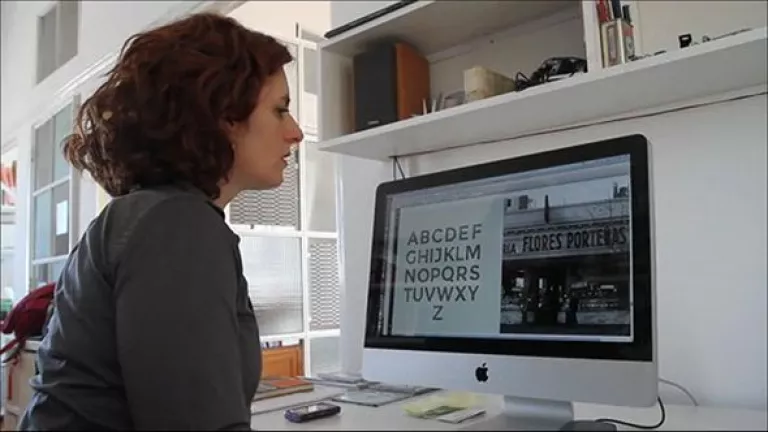
According to Google, Montserrat has the 8.67 billion number of usages in Google Fonts API. This font is featured in more than 22,000,000 websites. This proves that Montserrat is a well-known typeface created by Julieta Ulanovsky from Argentina. She was also inspired by the old posters and signages in the city of Buenos Aires.

This Montserrat font is licensed under the SIL Open Font License. That license is free that you can use this in your products & projects – print or digital, commercial or otherwise.

Julieta and Her contributors throughout the years

You can check on her official GitHub Montserrat, Kickstarter, and Google Fonts with these links:

2010

Ulanovsky began the Montserrat Font Project.

2011

She launched Montserrat typeface with Kickstarter, and wanted to reach $5,000 for publicly sharing to Google Fonts.

2014

Julieta Ulanovsky funded this project with $9,747 in 362 backers.

2015

Ulanovsky and her contributors such as Ale Paul, Carolina Giovagnoli, Andrés Torresi, Juan Pablo del Peral and Sol Matas were responsible for a full set of weights and italics.

2017

Jacques Le Bailly reworked the entire Latin design, while Juan Pablo del Peral and Sol Matas developed the initial Cyrillic extension with review and advise from Maria Doreuli and Alexei Vanyashin.

About the Creator

Julieta Ulanovsky

-is a post-graduate typeface design student in the Faculty of Architecture, Design and Urbanism of Buenos Aires University.

Classification of Montserrat

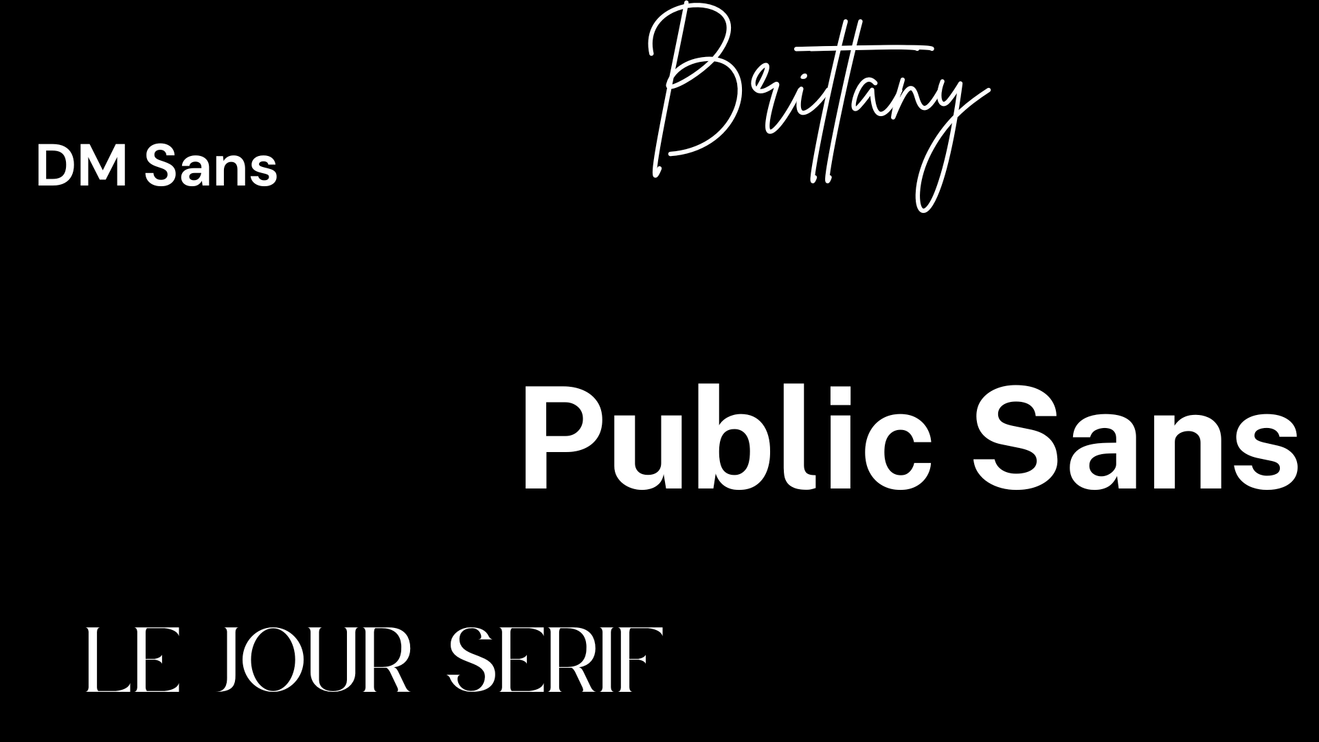
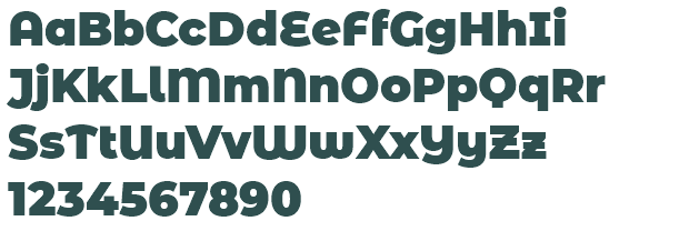
Geometry & Sans-serif

Characteristics of Montserrat

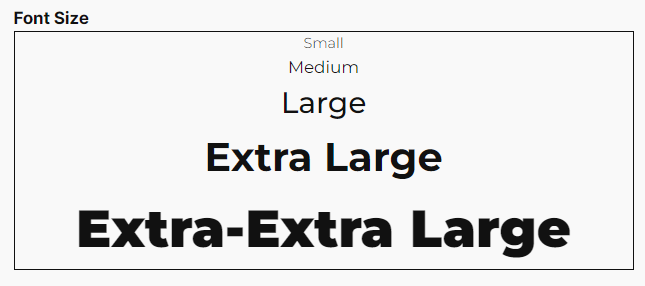
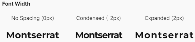
The ascenders, descenders and x-height of Montserrat get relatively higher than the cap height. This font has the same measure of baseline and its default letter spacing adding up with neatness. The bowl or the enclosed letter has already been wider. The typeface of Montserrat is similar to Calibri, Arial, Gotham, Futura, Open Sans, Helvetica, and Proxima Nova. Now, what makes this typeface unique are these specified letters:

  • Most fonts have a spur in which the capital G creates a small projection off a main stroke.
  • Montserrat does not apply in this case.
  • The capital J has a short stroke on the cap height while a font looks cutting through the edge.
  • The capital Q has the distinctive tail, which is more curvy than other serifs.
  • The lowercase k does not aligned perfectly to the ascender unlike the other typefaces.
  • The capital Among all ascenders, the lowercase t is the shortest. J has a short stroke on the cap height while a font looks cutting through the edge.

Variants of Montserrat

Font Weight

Montserrat Family

She made another two sister families, which are Alternates and Subrayada.
Montserrat Alternates
Montserrat Alternates has the rounded style while still holding the uniqueness of the typeface.
Montserrat Alternates
Montserrat Subrayada is an sans-serif clipped with wide line on the bottom. Also, that not ends with its unique and renewed capital letter Q.

Why did it become my favorite typeface?

From what I experienced, I think that I could familiarize this typeface among all fonts because I find it comforting. When I would describe it, the blend of simplicity and elegance has flourished. Because of the geometric design, it looks the ideal of busy cities that try to find my comfort place.

Where do I usually use this typeface?

I usually use this typeface on the following:

What are the good use cases of this typeface?

What are other typefaces that can be paired with this typeface?

What I would recommend is these font pairings (Heading and Subheading only):

Click the picture for more information.

Contact Me

Please feel free to contact me if you need any further information.

Thank you! Your submission has been received!
Oops! Something went wrong while submitting the form.